
VISUAL DESIGN PROJECT
Mission:
To craft meaningful connections through quality, community, and flavor.
Infuse is dedicated to delivering artisan coffee, handcrafted pastries, and locally sourced goodness in a welcoming, design-forward environment that reflects our small-town roots and big-hearted values.
Vision:
To become Colorado Springs’ go-to destination for coffee, connection, and community. Infuse envisions a space where modern café culture and local pride blend seamlessly — a hub that supports regional makers, fosters daily rituals, and inspires everyday indulgence.
Target Audience:
Infuse appeals to a diverse, community-driven audience aged 16 to 45 who value high-quality, small-batch products and take pride in supporting local businesses. They seek out spaces that are both modern and inviting—where design, authenticity, and sustainability come together. Whether it’s grabbing an artisan latte, meeting up with friends, or enjoying handcrafted pastries, this audience appreciates a thoughtfully curated experience that reflects their lifestyle and values.
Research & Insights
To successfully position a new café in today’s competitive market, understanding the landscape shaped by major players like Starbucks, Panera Bread, and local chains is crucial. These established brands provide insights into customer expectations, service standards, and market gaps, which can inform the new café's strategy for differentiation and success.
With a clear understanding of competitors’ strengths and weaknesses, the new café has the opportunity to create a welcoming, innovative space that resonates with both local customers and a broader audience.

Moodboards
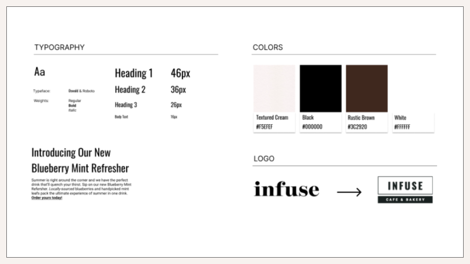
Infuse Cafe & Bakery’s moodboards explore a range of themes to capture the brand’s unique ambiance and aesthetic. The Modern Minimalist theme centers on clean lines, neutral tones, and ample white space, highlighting simplicity and elegance.

The Artisan Chic theme combines vibrant colors with handcrafted details, reflecting the artisanal quality of Infuse’s offerings.

Rustic Comfort brings warmth and authenticity, with earthy colors, wood textures, and cozy accents that create a homey atmosphere.

Lastly, Food Mood Board showcases a flexible, seasonal palette with subtle nods to nature, incorporating floral and foliage elements that can evolve with the seasons, adding freshness to the brand's food and drink menu.

Infuse Cafe & Bakery Style Guide brings warmth and authenticity, with earthy colors, wood textures, and cozy accents that create a homey atmosphere.
Wireframing Process
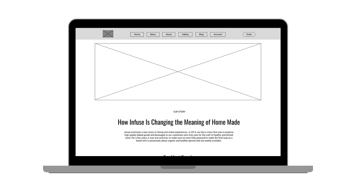
Low-Fidelity Wireframing
The initial idea for the first draft of the wireframes involved using rectangular frames with bold colors. However, I felt that this approach made it resemble the Starbucks aesthetic too closely, giving it a lack of originality and depth in composition.
The navigation bar was designed to be straightforward for desktop users, with a hamburger menu implemented for mobile and tablet users. This approach is quite common, as shown by the research collected.
I went with the idea of using a large hero image frame that works well for showcasing "featured products," which can be updated for holidays, monthly events, or discounts. The footer contains company information and links to social media.

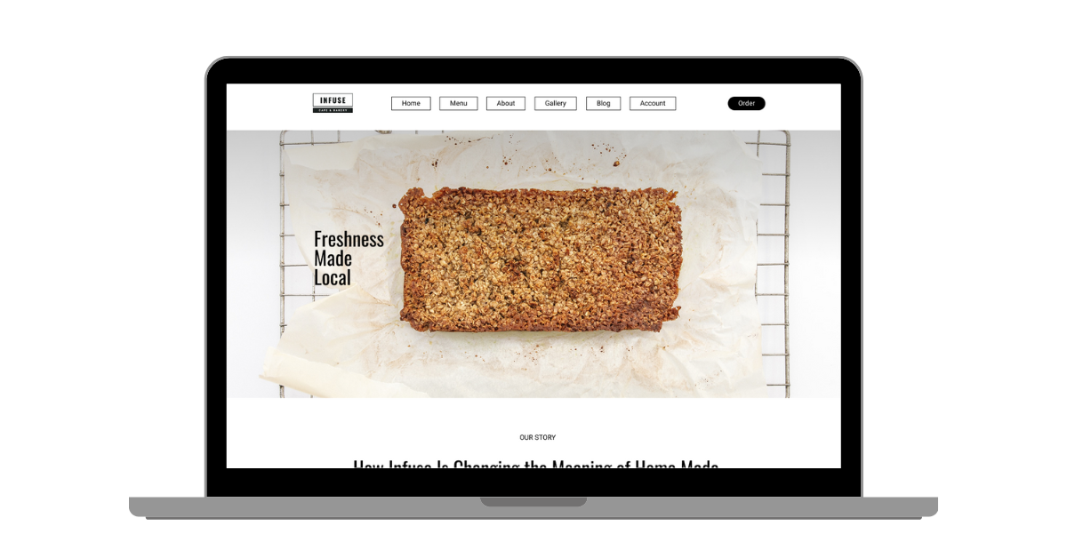
High-Fidelity Wireframing
The high-fidelity wireframe differs significantly from the initial draft. Many elements have been rearranged, and text has been added to illustrate the overall flow of content and layout for the landing page.
I retained the large hero image and updated the navigation bar to include external links directing users to other pages, such as "menu" and "gallery." Based on prior research, I focused on making the navigation bar and ordering process as straightforward and user-friendly as possible, ensuring easy access to essential information.
The middle section features a swipeable menu showcasing Infuse's most popular dishes for user convenience, highlighting top selections from each food and drink category. The Loyalty Program area is kept straightforward, with clear login and sign-up calls to action. A blog section provides information for users to learn more about Infuse. Finally, the footer includes company information, a newsletter sign-up field, and social media links.
Concept Imagery to High-Fidelity Wireframing
My favorite part of the wireframe process was selecting the imagery, especially deciding on the style of food photography to use. I wanted to avoid a “high-production” look, opting instead for a “rustic, authentic, and simple” style. A wood or brown-toned background was ideal to make the colors of the foods and drinks pop.
The hero image featuring granola was a strong horizontal attention-grabber, but as granola isn't as visually enticing as other foods or drinks we could showcase, it may not be the best fit. The "Most Popular" section includes an image representing each category, while the blog images are styled to be more "stock-like" than the food images, providing a bit of visual contrast for users.
Overall, I aimed to use a cream or beige textured background to help distinguish each section.
Interactive Mockups


Challenges & Reflection
A major challenge in this project was achieving a balanced design that felt unique yet user-friendly across both desktop and mobile devices. Finding the right style of imagery and layout to engage users while maintaining simplicity required several iterations and user testing. I overcame these challenges by focusing on feedback and refining elements to better suit user preferences and behaviors.
Through this process, I gained valuable insights into the importance of flexibility in design—how essential it is to adapt and tailor visual elements based on context and platform. Moving forward, I’ll apply these insights by prioritizing user-centered design practices, ensuring that visuals not only capture attention but also enhance usability. This experience reinforced the value of iterative design and testing, which I’ll continue to integrate into future projects to create more effective and appealing designs.
If you enjoyed this, please check out my other design projects!